
Earlier today, I was messing with displaying forms within a dialog.
The basic view was split into a 2-column layout with some information on the left and then the actual form elements on the right. My form happens to have a textarea in it. Additionally, the left-hand column can expand to some predefined max-height with a scroll-bar applied. This works well, but it creates a visual problem in that the left-hand column can be taller than the right-hand column and its form elements.
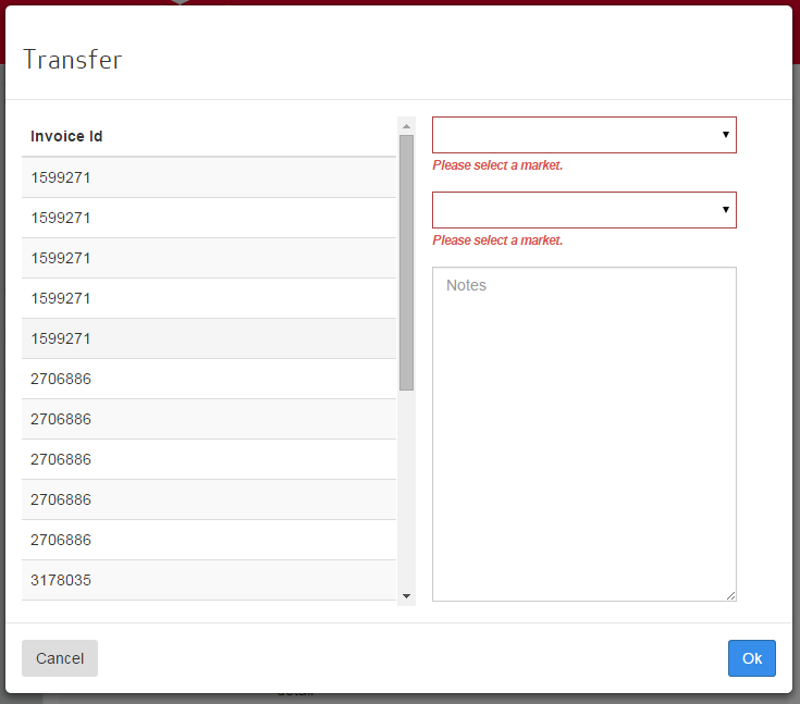
It looks like this:

In terms of spacing, it’s pretty ugly. You may think it’s ugly just in general, but that’s beside the point! 🙂
My idea to fix this was to make the textarea dynamically expand to fill the right-hand columns available space. Unfortunately, this is not very straight forward to achieve with straight CSS. Sure, we could just go the jQuery/JavaScript route and expand the textarea basic on the modal body’s height, but that’s not desireable.
After a bit of playing, I found a few tricks to achieve the results I wanted with the CSS3 flex stylings.
If you’ll recall, the boostrap basic modal HTML is like so:
<div class="modal-header">
	<h3"> ..some header here ..</h3>
</div>
<div class="modal-body">
	..body here
</div>
<div class="modal-footer">
	..stuff here
</div>
I expanded this a bit to include the layout I wanted with additional classes:
<div class="modal-header">
	<h3"> ..some header here ..</h3>
</div>
<div class="modal-body modal-max-height">
	<div class="row">
		<div class="modal-scroll-content fixed">
			..body here
		</div>
		<div class="modal-form fixed">
			<form name="mf.modalForm" novalidate>
				.. form-group's here
				.. flex-container form-group at the bottom
				<div class="form-group flex-container">
					<textarea />
				</div>
			</form>
		</div>
	</div>
</div>
<div class="modal-footer">
	..stuff here
</div>
The “modal-max-height” lets me set a predefined maximum height on the body. From there, we have our left-column with “modal-scroll-content” applied. This basically lets the scrollable content grow to a given max-height with vertical scrollbars on content exceeding the max-height.
From there, since I didn’t want to mess up all of my other modals, if “modal-scroll-content” also has a class of “fixed,” then we’ll float the content and give it a set width.
On to the flex settings. The div itself has absolute position applied to it to force it to fill the available vertical space regardless of its content. We also need to apply flex settings so that, eventually, we can have its child elements expand proportionately to fill remaining space. This is achieved by giving it a display of flex and setting flex-direction:
.modal-max-height {
    min-height: 175px;
    max-height: 500px;
    padding-top: 0;
}

.modal-max-height .modal-scroll-content {
    max-height: 450px;
    overflow-y: auto;
    margin-top: 15px;
}

.modal-max-height .modal-scroll-content.fixed {
    width: 50%;
    float: left;
    margin-left: 15px;
}

.modal-form.fixed {
    width: 45%;
    margin-left: 30px;
    padding-right: 5px;
    padding-top: 15px;
    position: absolute;
    height: 100%;
    left: 50%;
    max-height: 465px;
    display: flex;
    flex-direction: column;
}
With these styles in place, we set the flex attribute to 2 on the form to force it to fill the div. But note, our form-groups are nested, so we effectively have to apply the same styles to the child form-group (the one containing the textarea) to allow the textarea to grow. Note that I applied the class of “flex-container” to the last form-group that contains the textarea.
.modal-form form {
    flex: 2;
    display: flex;
    flex-direction: column;
}

.modal-form form .flex-container {
    flex: 2;
    display: flex;
}
Finally, we apply the flex:2 to the textarea:
.modal-form form .flex-container textarea {
    flex: 2;
}
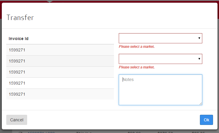
With all of those styles in place, the desired result is achieved. This is how it looks with the scrollable content at max height:
But it’s easy to see that it works for smaller content blocks:
How does CSS flexible layout (flex) work?
To start, thing of it as a grid-system. Setting a container to “display: flex” effectively sets the container to be a flexible container. The layout for the container is defined by setting the flex-direction. Flex defaults to row, aligning all child flex elements as a single row. But setting it so column sets this to stack all of the elements vertically into a single column. Once all of the child elements are arranged as a single column, we really only need to set their flex property to define how they grow to fit their respective (virtual) grid container. With flex:2, this is really short-hand for setting its “flex-grow” property. We could also pass in (2) other properties that would set flex-shrink and flex-basis, but for the the purposes of this demo, there’s no need to set these properties. Flex-grow tells flexible layout how the element should grow relative to its other flex siblings. Or said a different way, how the available space is distributed. Technically, since all of the flex-children have no siblings, this value could be anything (1..2..3, etc) and the flex item would still expand to fill all of the available flex-container’s vertical space.