
Making arrow blocks in CSS is pretty easy. You can manipulate the borders of elements, create outlines with overlapping arrows, and other neat things.
One place where I’ve used this is for letting a user visually step through the process of a guided wizard.
Creating, for example, an arrow pointing to the left, we could use a DIV element like so:
.arrow-left {
width: 0;
height: 0;
border-top: 30px solid transparent;
border-bottom: 30px solid transparent;
border-right:30px solid black;
}
But now, imagine that we want to put arrows on the ends of content elements, give it visual styling so that it has a nice outline, appears cohesive, and seems to project into a sibling element. This is what a typical wizard progress might look like:
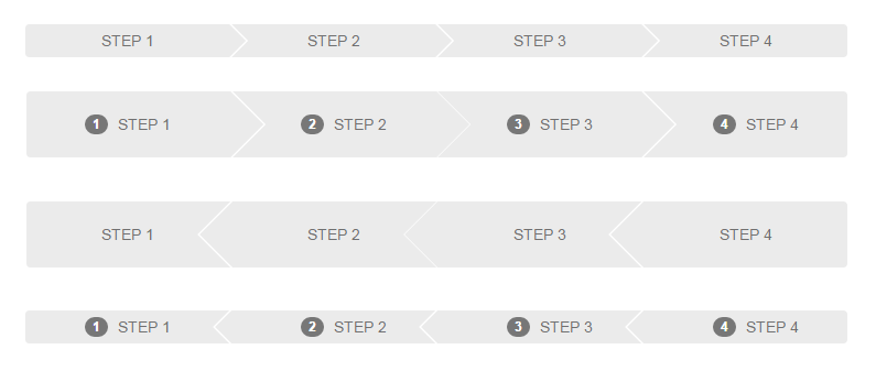
Notice there are (2) different heights and (2) different styles. One style has arrows pointing to the right and the other has them pointing to the left. The “badge” which shows the step number is optionally displayed as well.
The HTML mark-up for this is pretty simple:
<div class="wizard small row ng-cloak" ng-cloak>
	<a ng-repeat="state in vm.states" ng-click="vm.setCurrent(state)" ng-class="{ 'current': state.isCurrent }">
		<div class="badge">
			<div class="border"></div>
			<div class="number">{{$index + 1}}</div>
		</div>
		{{ state.name }}
	</a>
</div>
Each “step” is basically an anchor with the badge and a label. To get the nicely styled arrows, our basic premise is to create arrows after the anchor, which is the same color as the anchor’s background w/ a bump in z-index, and then the next anchor will have a white arrow to create the outline. Using pseudo “before” and “after” elements in our CSS faciliates keeping our mark-up simple and clean. Using some margin adjusts and treating the before/after elements as our styled arrows, we can create the effect entirely in CSS. It looks partially like this:
.wizard a {
padding: 20px 12px 20px;
position: relative;
display: inline-block;
text-decoration: none;
min-width: 24.75%;
margin-left: 0.25%;
text-align: center;
text-decoration: none;
font-size: 14px;
color: #707070;
background: #EBEBEB;
text-transform: uppercase;
cursor: pointer;
}

.wizard a:hover {
text-decoration: none;
}

.wizard a:first-child {
margin-left: 0;
}

.wizard:not(.left-arrow) a:before {
width: 0;
height: 0;
border-top: 30px inset transparent;
border-bottom: 30px inset transparent;
border-left: 30px solid #FFFFFF;
position: absolute;
content: "";
top: 0;
left: 0;
}

.wizard:not(.left-arrow) a:after {
width: 0;
height: 0;
border-top: 30px inset transparent;
border-bottom: 30px inset transparent;
border-left: 30px solid #EBEBEB;
position: absolute;
content: "";
top: 0;
right: -30px;
z-index: 2;
}

.wizard a:first-child:before,
.wizard a:last-child:after {
border: none;
}
Here’s a working fiddle illustrating how this would look once tied into JavaScript to style the “current” step through the wizard. Keep in mind that the min-width would need to be adjusted, accordingly, to make the progress indicator fill the view horizontally. I create it with four progress steps in mind.